
The Trending Interior Paint Colors of 2024 in San Francisco
Soft Earth Tones
One of the most significant trends this year is the return to nature-inspired hues. Soft earth tones, such as warm beiges, muted greens, and gentle terracottas, are making a strong comeback. These colors create a calming and grounding atmosphere, perfect for living rooms and bedrooms where relaxation is key.
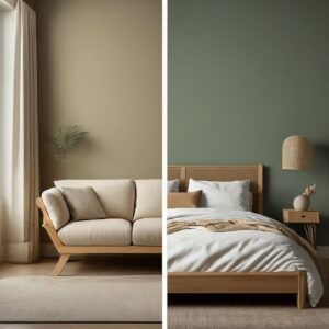
Why You’ll Love It: Earth tones bring a sense of stability and warmth to a space. They are versatile and pair well with various materials, from wood to metal, enhancing both modern and traditional interiors.
Serene Blues
In 2024, blues are making a significant impact in interior design, ranging from deep navy to soft sky blue. These hues evoke feelings of tranquility, calmness, and peace, creating a soothing atmosphere in any space. Blues are ideal for areas where relaxation is essential, such as bedrooms and bathrooms. The varying shades add depth and dimension to a room, making it visually interesting.

Why You’ll Love It: Blue has a natural calming effect and can make a room feel more spacious. It’s perfect for creating a serene sanctuary in your home, helping to reduce stress and promote relaxation.
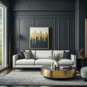
Bold Jewel Tones
For those who want to make a statement, bold jewel tones like emerald green, sapphire blue, and amethyst purple are trending this year. These rich, luxurious colors add depth and sophistication to any room.
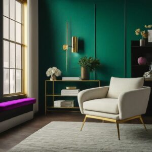
Emerald Green is a bold and refreshing color, like the gemstone, and represents nature and growth. Sapphire Blue, inspired by the gem, is elegant and calming. Amethyst Purple, named after the gemstone, adds a touch of luxury and creativity. These jewel tones are popular because they add depth and make rooms feel more interesting and layered. They bring a sophisticated and luxurious feel to any space. Even though they are bold, these colors are versatile and can be used on accent walls, furniture, or accessories.
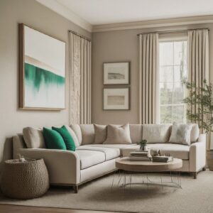
Warm Neutrals
Warm neutrals, like creamy whites, taupes, and soft grays, are really popular right now. They make a great background for any decorating style, letting your furniture and decorations stand out.
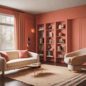
Vibrant Corals and Peaches
Black is elegant and refined, representing sophistication beyond just edgy looks. Use it sparingly as an accent in furniture, frames, or accessories to create contrast and draw attention, or go bold with entire black walls paired with contrasting elements. It’s popular for its modern edge, pairing well with metallics, whites, and neutrals, and its versatility in both minimalist and maximalist styles. Whether in small amounts or large areas, black stands out and adds a contemporary touch.
Why You’ll Love It: Black can make a powerful statement and adds a level of sophistication that few other colors can. It pairs well with metallic accents and can make artwork and decor stand out beautifully.
Eco-Conscious Greens: A Sustainable Color Trend
In recent times, there has been a significant shift toward sustainability and environmental awareness. As a result, eco-conscious greens have emerged as a prominent color trend.
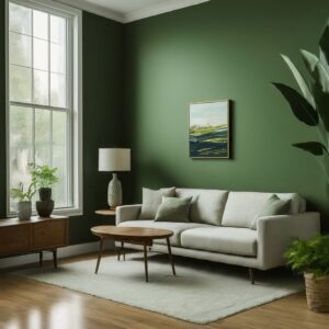
Olive Green is inspired by the color of olives, bringing warmth and a natural feel, making it suitable for many uses. Sage Green, linked to wisdom and calmness, offers a soothing gray-green shade. Forest Green reminds us of lush forests, symbolizing growth and connection to nature. These greens reflect eco-friendly choices and create a relaxing and balanced atmosphere. Forest Green’s rich color represents vitality and renewal, refreshing our busy lives. In fashion, these eco-friendly greens are popular in clothes and accessories, offering a fresh look. In home decor, they are perfect for creating peaceful bedrooms, cozy living areas, or nature-inspired accents. Many brands focused on sustainability use these greens in their logos and packaging to show their commitment to the environment.
Why You’ll Love It: Green is associated with nature and tranquility. Eco-conscious greens are not only beautiful but also symbolize a commitment to a more sustainable lifestyle, making them a meaningful choice for your home.
How to Choose the Right Color for Your Space
Selecting the right paint color can be a daunting task, but considering the following tips can help make the process smoother:
- Consider the Room’s Purpose: Think about how you use the room and what mood you want to create. Soft blues and greens are great for relaxing spaces, while vibrant colors like coral can add energy to active areas.
- Test Before You Commit: Always test paint colors in your space before making a final decision. Colors can look different depending on lighting and other elements in the room.
- Balance with Existing Decor: Consider your current furniture and decor. The right paint color should complement and enhance the existing elements in your room.
- Don’t Be Afraid to Experiment: While neutral colors are a safe choice, don’t be afraid to experiment with bolder shades. Accent walls or smaller areas can be a great way to introduce a pop of color without overwhelming the space.
Final Thoughts
The trending interior paint colors of 2024 offer something for everyone, from soothing earth tones to vibrant jewel tones and everything in between. Whether you’re looking to create a serene retreat or a bold statement, these colors can transform your space into a reflection of your style and personality. Embrace these trends and let your home become a canvas for creativity and inspiration.
Need help choosing the perfect paint color? Visit tomthepaintersf.com for expert advice, color consultations, and a wide range of premium paints. Our team of professionals is here to help you bring your vision to life. Explore our collection today and discover the possibilities for your home.
The Trending Interior Paint Colors of 2024 in San Francisco
Soft Earth Tones
One of the most significant trends this year is the return to nature-inspired hues. Soft earth tones, such as warm beiges, muted greens, and gentle terracottas, are making a strong comeback. These colors create a calming and grounding atmosphere, perfect for living rooms and bedrooms where relaxation is key.
Why You’ll Love It: Earth tones bring a sense of stability and warmth to a space. They are versatile and pair well with various materials, from wood to metal, enhancing both modern and traditional interiors.
Serene Blues
In 2024, blues are making a significant impact in interior design, ranging from deep navy to soft sky blue. These hues evoke feelings of tranquility, calmness, and peace, creating a soothing atmosphere in any space. Blues are ideal for areas where relaxation is essential, such as bedrooms and bathrooms. The varying shades add depth and dimension to a room, making it visually interesting.
Why You’ll Love It: Blue has a natural calming effect and can make a room feel more spacious. It’s perfect for creating a serene sanctuary in your home, helping to reduce stress and promote relaxation.
Bold Jewel Tones
For those who want to make a statement, bold jewel tones like emerald green, sapphire blue, and amethyst purple are trending this year. These rich, luxurious colors add depth and sophistication to any room.
Emerald Green is a bold and refreshing color, like the gemstone, and represents nature and growth. Sapphire Blue, inspired by the gem, is elegant and calming. Amethyst Purple, named after the gemstone, adds a touch of luxury and creativity. These jewel tones are popular because they add depth and make rooms feel more interesting and layered. They bring a sophisticated and luxurious feel to any space. Even though they are bold, these colors are versatile and can be used on accent walls, furniture, or accessories.
Warm Neutrals
Warm neutrals, like creamy whites, taupes, and soft grays, are really popular right now. They make a great background for any decorating style, letting your furniture and decorations stand out.
Vibrant Corals and Peaches
Black is elegant and refined, representing sophistication beyond just edgy looks. Use it sparingly as an accent in furniture, frames, or accessories to create contrast and draw attention, or go bold with entire black walls paired with contrasting elements. It’s popular for its modern edge, pairing well with metallics, whites, and neutrals, and its versatility in both minimalist and maximalist styles. Whether in small amounts or large areas, black stands out and adds a contemporary touch.
Why You’ll Love It: Black can make a powerful statement and adds a level of sophistication that few other colors can. It pairs well with metallic accents and can make artwork and decor stand out beautifully.
Eco-Conscious Greens: A Sustainable Color Trend
In recent times, there has been a significant shift toward sustainability and environmental awareness. As a result, eco-conscious greens have emerged as a prominent color trend.
Olive Green is inspired by the color of olives, bringing warmth and a natural feel, making it suitable for many uses. Sage Green, linked to wisdom and calmness, offers a soothing gray-green shade. Forest Green reminds us of lush forests, symbolizing growth and connection to nature. These greens reflect eco-friendly choices and create a relaxing and balanced atmosphere. Forest Green’s rich color represents vitality and renewal, refreshing our busy lives. In fashion, these eco-friendly greens are popular in clothes and accessories, offering a fresh look. In home decor, they are perfect for creating peaceful bedrooms, cozy living areas, or nature-inspired accents. Many brands focused on sustainability use these greens in their logos and packaging to show their commitment to the environment.
Why You’ll Love It: Green is associated with nature and tranquility. Eco-conscious greens are not only beautiful but also symbolize a commitment to a more sustainable lifestyle, making them a meaningful choice for your home.
How to Choose the Right Color for Your Space
Selecting the right paint color can be a daunting task, but considering the following tips can help make the process smoother:
- Consider the Room’s Purpose: Think about how you use the room and what mood you want to create. Soft blues and greens are great for relaxing spaces, while vibrant colors like coral can add energy to active areas.
- Test Before You Commit: Always test paint colors in your space before making a final decision. Colors can look different depending on lighting and other elements in the room.
- Balance with Existing Decor: Consider your current furniture and decor. The right paint color should complement and enhance the existing elements in your room.
- Don’t Be Afraid to Experiment: While neutral colors are a safe choice, don’t be afraid to experiment with bolder shades. Accent walls or smaller areas can be a great way to introduce a pop of color without overwhelming the space.
Final Thoughts
The trending interior paint colors of 2024 offer something for everyone, from soothing earth tones to vibrant jewel tones and everything in between. Whether you’re looking to create a serene retreat or a bold statement, these colors can transform your space into a reflection of your style and personality. Embrace these trends and let your home become a canvas for creativity and inspiration.
Need help choosing the perfect paint color? Visit tomthepaintersf.com for expert advice, color consultations, and a wide range of premium paints. Our team of professionals is here to help you bring your vision to life. Explore our collection today and discover the possibilities for your home.